
Website Design
May 5, 2025
More people visit your site on their phone than a laptop — here’s why designing for mobile first isn’t optional anymore (and what happens when you don’t).
Executive Summary
You lose people if your website looks bad or doesn't work well on a phone. Period. Mobile-first design is no longer just a smart strategy — it’s a must. In 2025, most users will visit your site from their phone, not a laptop. This blog breaks down what mobile-first means, why it’s essential, and how it can seriously impact how professional your brand feels.
The First Impression Happens on a Phone
Let’s be honest: most of us check out new websites while standing in line, lying on the couch, or scrolling between texts. That means your audience isn’t sitting at a big desktop monitor with time to explore every corner of your homepage — they’re on their phones and judging fast.
Statista says over 55% of global website traffic comes from mobile devices. So, if your site isn’t built to work beautifully on small screens, you’re turning away more than half your potential audience before they see what you do.
Mobile-First Isn’t Just a Buzzword
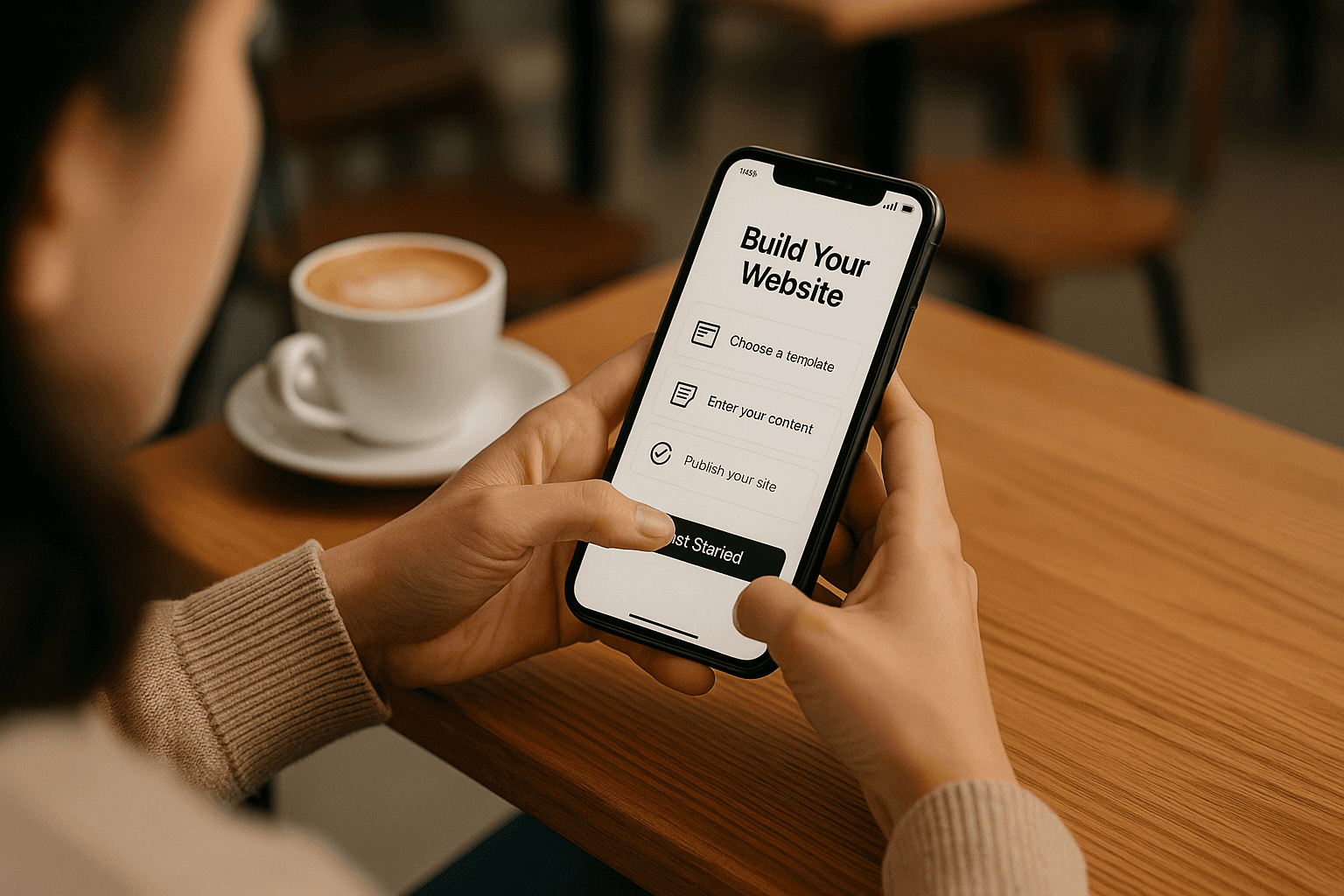
“Mobile-first design” isn’t about shrinking your desktop site to fit a phone. It means designing with the phone in mind first, from the layout to the content to how fast it loads. It’s about creating a site that feels as smooth and intuitive on an iPhone or Android as on a laptop.
This approach forces you to focus on what matters. You don’t have space for clutter or long-winded paragraphs. You must get to the point quickly. And when you do, visitors are way more likely to stick around.
Google Cares About Mobile Too
If you’re thinking, “Okay, but can’t people just pinch and zoom?”, here’s something that might change your mind: Google ranks your website based on its mobile version first. That’s right — mobile-first indexing is now the default.
According to Google Search Central, if your mobile site is broken, hard to use, or missing content, your rankings will suffer — even if your desktop site is flawless. So, this isn’t just about user experience. It’s about being found in the first place.
It’s Not Just About How It Looks
Designing for mobile is about more than fitting things on a screen. It’s about how your content feels to interact with. Can people read your headlines without zooming? Can they tap your buttons without hitting the wrong thing? Do your contact forms work?
If your site has tiny fonts, cluttered layouts, or buttons that make people squint, they will bounce fast. That’s not a vibe you want associated with your brand. A smooth mobile experience tells people you care about the details and are running a professional operation.
How to Know If Your Site Is Mobile-First
Are you not sure if your website is truly mobile-friendly or just okay? Do a quick test. Pull it up on your phone and pretend you’re a first-time visitor. Does it load quickly? Are the most essential things visible right away? Can you navigate it without frustration?
You can also run it through Google’s Mobile-Friendly Test for a technical checkup. But trust your gut, too — if the mobile version feels awkward or clunky, your visitors probably think that too.
Mobile-First = Client-Friendly
Here’s the big takeaway: mobile-first isn’t about trends or tech. It’s about people. It’s about creating a brand experience that feels easy, welcoming, and polished — especially when someone finds you on their phone, which they probably will.
A mobile-first site loads fast. It communicates clearly. It respects people’s time. And it works everywhere, from the tiniest screen to the largest desktop monitor. That kind of experience builds trust, and trust leads to new clients.
Final Thoughts
If your website was built a few years ago, it’s probably due for a mobile-first glow-up. And if you’re launching something new, starting with mobile is one of the smartest moves you can make. It’s how you meet people where they are — and show them you’re worth sticking with.
Need help making it happen? At DesignSpark Studio, we build every site with mobile-first thinking baked in because your brand deserves to feel polished on every screen.
Blog you may like

From Samuel Pullen Design to DesignSpark Studio
We’re now DesignSpark Studio — learn what’s changing, what’s staying the same, and how our new plans bring even more value to your creative partnership.
3 min read
Feb 27, 2025
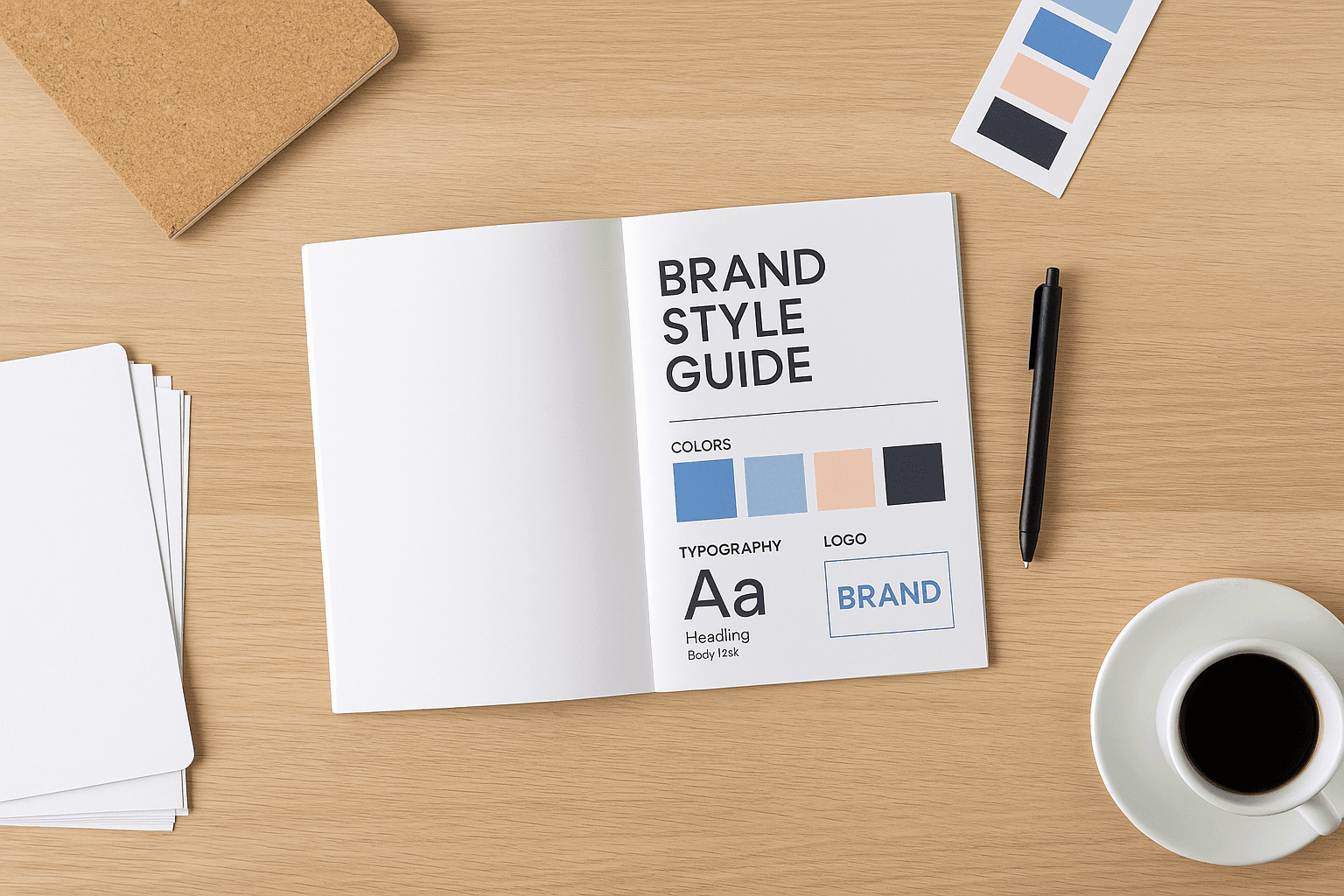
Why Your Brand Needs a Style Guide
Discover why brand consistency matters and what to include in a style guide to keep your visuals and voice aligned.
4 min read
Apr 22, 2025
